Publishing tools for independent creators

Context
I joined Steady's team when the strategic direction for the next 9 months was already in motion: start hosting content to allow creators to join even if they don’t have an audience or technical know-how to send newsletters or distribute podcasts. The product used a basic post editor, hosted podcasts through an external service and no newsletter feature.
Goal: get independent media creators on Steady earlier in their career, when they are still building their audience, so we can help them throughout their growth journey.
Challenges
Since this initiative's goal was to capture a new user category, or people earlier in their creator journey, we didn’t have an easily accessible group for conducting research, and the planned deadline didn’t leave much time for research and design.
Design v1.0

The research I could conduct under the circumstances was collecting existing knowledge through internal stakeholder interviews to understand the what drove the company this new direction, and understand what mattered to our existing users. I also looked at competitor’s solutions to know what functionality was expected from the start.

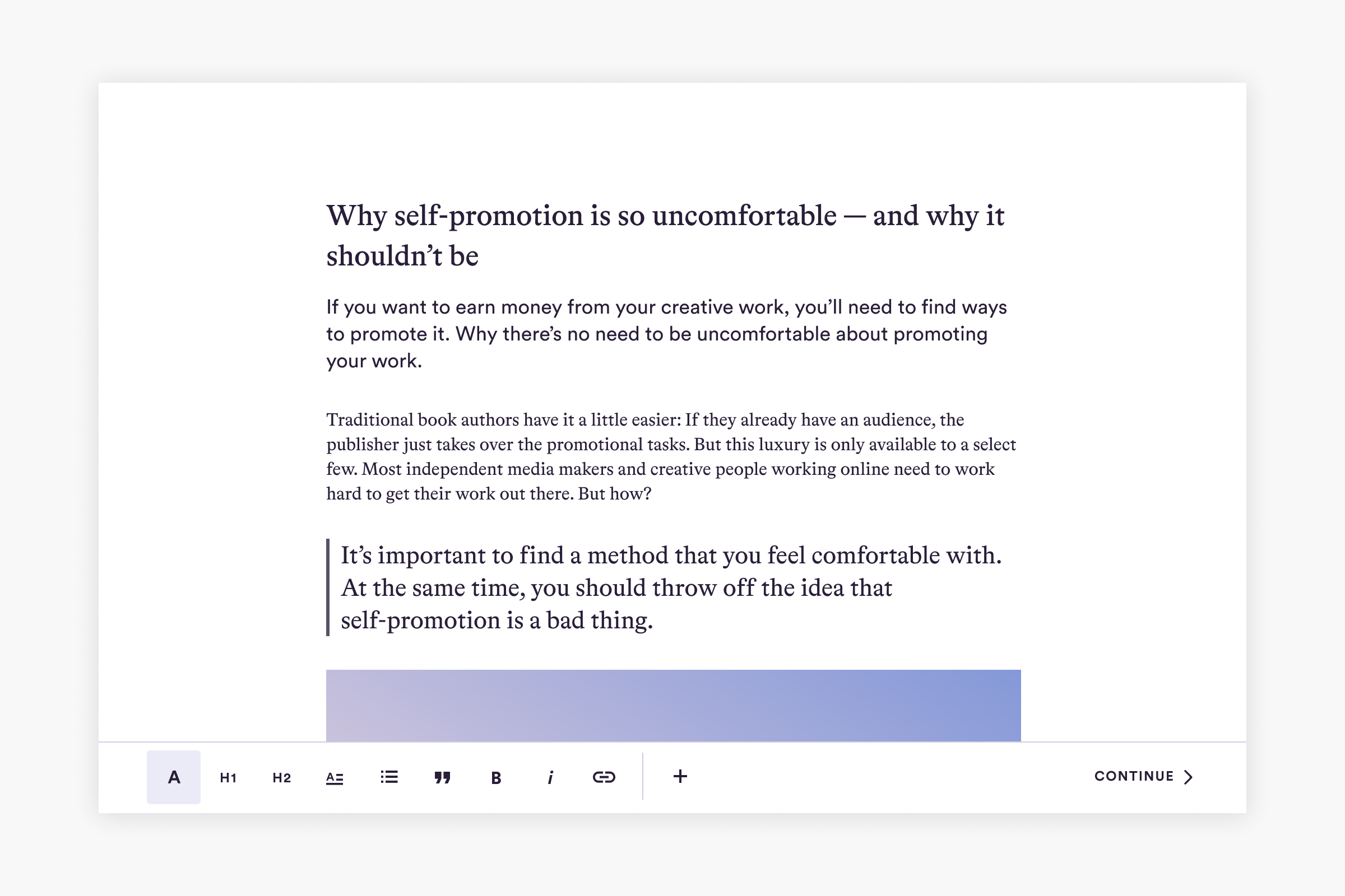
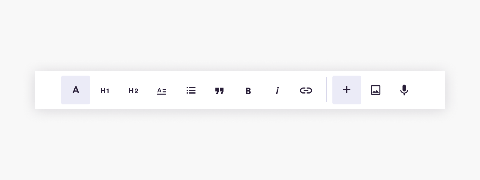
Based on that, we went ahead with basic functionalities we could all agree on to publish posts, podcasts and send newsletters. We also committed to expanding the capabilities as we learned more about this new user group.
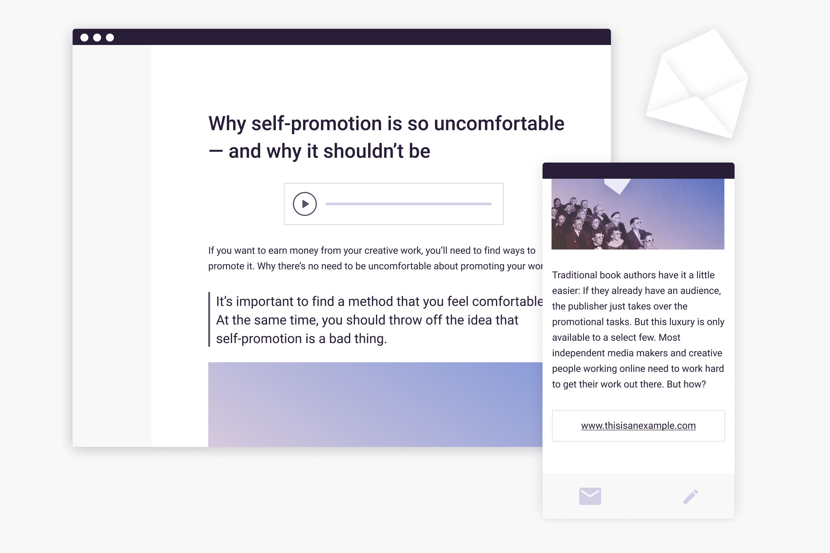
While the content appearing on Steady’s platform looks great thanks to my colleague's work, I also designed the newsletters appearing in the subscriber’s mailboxes.

The functionalities we added later:
- dynamic paywall that can start at any point in the post, not just at the top
- adding a CTA button to help creators grow their audience and revenue
- alt text for images
- URL linking within images
Design v2.0
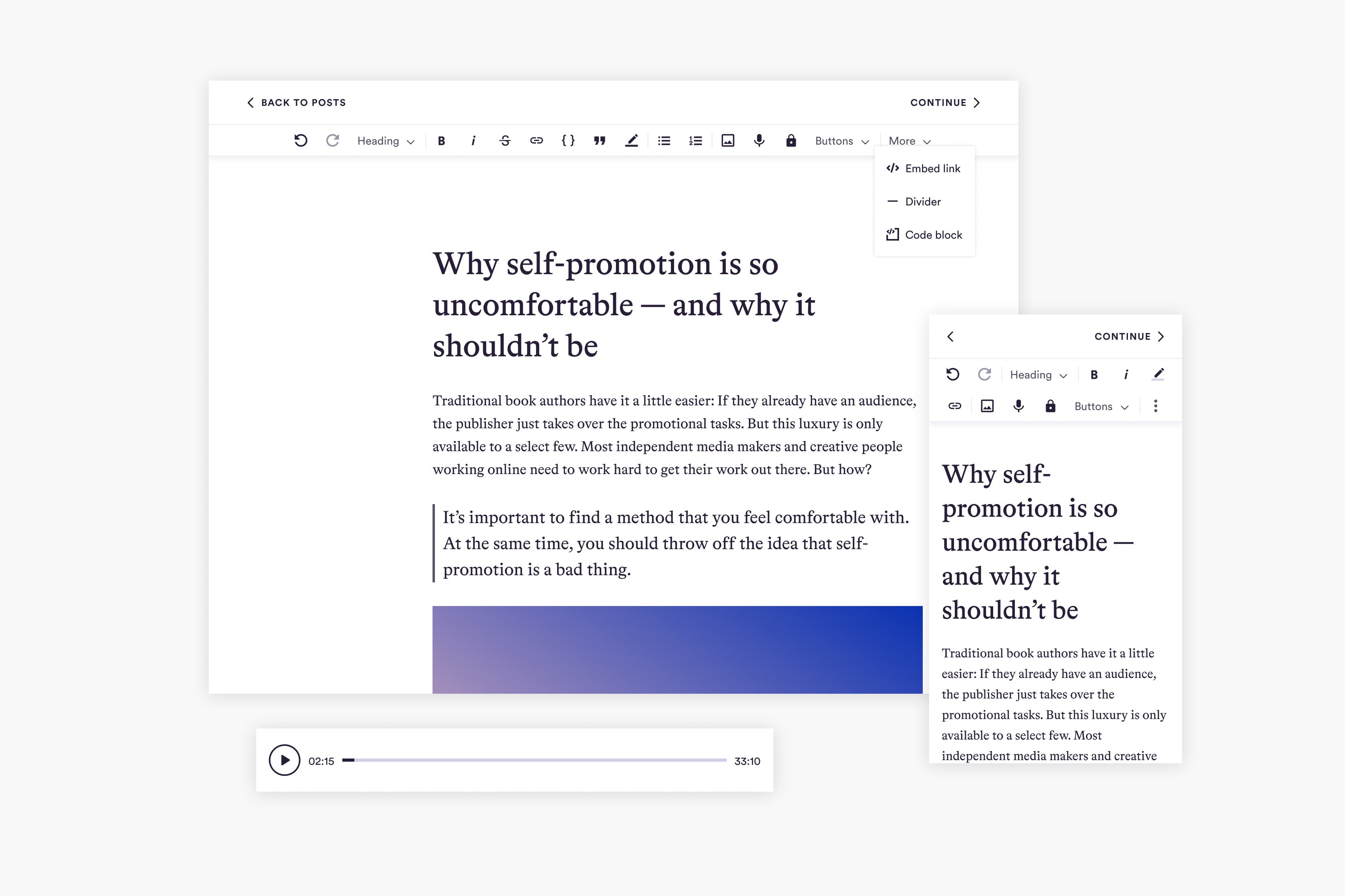
After technical refactoring, a second redesign enabled us to include functionalities now expected by users. We’ve continuously collected user input from discovery interviews, support tickets, feature requests and screen recordings, so after the refactoring we could get started. On top of that, our current menu structure was getting crowded as the list of expected functionalities significantly grew.
Results
Based on the new library, we could add:
- more headings
- more text styling options
- colorful text highlights
- inline code and code block
- tooltips for the keyboard shortcuts on hover
We also created a simpler editing flow by moving all elements into a top menu with a cleaner look, which also helped not to interfere with the keyboard on mobile.
Something I would have still liked to add: a separate podcast editor. Based on general usability interviews and screen recordings, it seemed to be a frictionful experience to publish podcast episodes in this editor .