Brand and visual design at Steady
Context
I worked at Steady on the visual identity next to my product design role. Since both the product and the marketing team owned visual identity, I collaborated with both teams on larger reworks as well as incremental changes, such as:
- Homepage and landing page designs
- Illustrations, social media content
- Adding a serif typeface
- Expanding the icon set
- Design system 2.0
Homepage and landing page designs
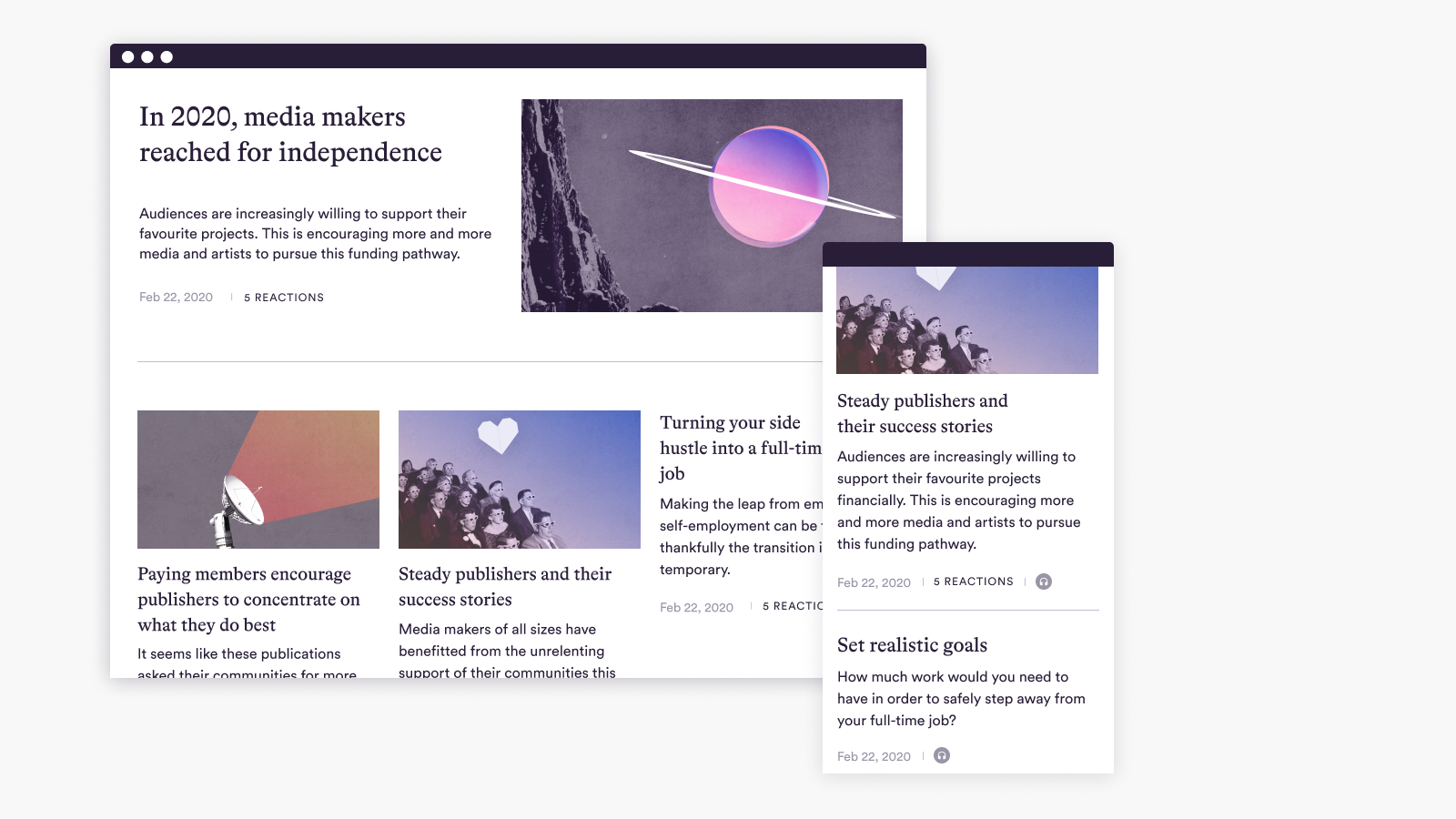
In 2022, we expanded the marketing pages to show the relevant product features for each creator and publisher segment: newsletter writers, magazines, podcasters, videobloggers and Instagrammers. I created a template to be 'filled in' with the different segments together with the marketing team.
- I proposed content sections and prioritised them with our Head of Product and Head of Marketing to determine the order of storytelling
- While the copywriters worked on the text, I worked on the landing page for podcasters, which had to be ready for the launch of the Spotify Open Access feature
- We put design and copy together in Figma
- I handed over the project for the rest of the pages to another designer
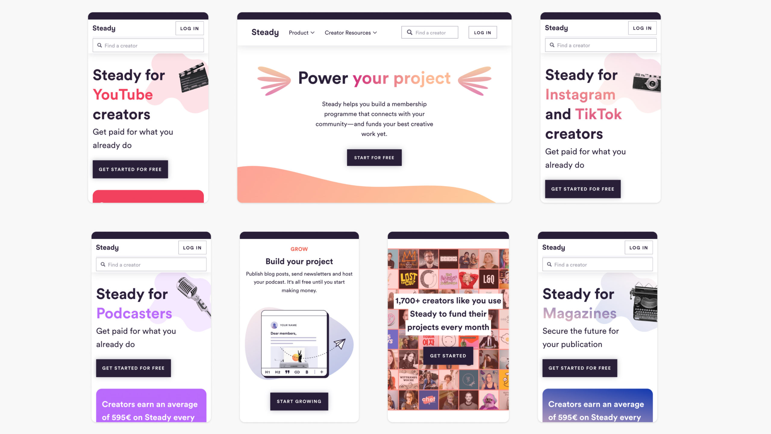
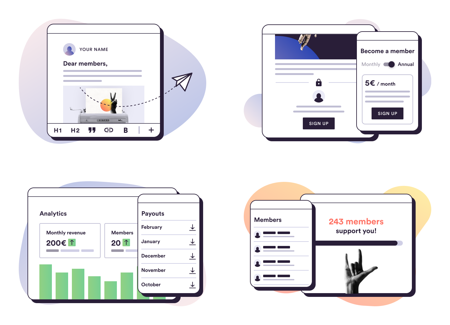
This project included the first of a new style of illustrations we nicknamed 'baby screens' to highlight the new product feature and to create a better match for our current brand tone. I created several tiny equivalents of our UI elements to build a 'toy design system', where I could quickly put together the illustrations when needed, or (some of) my colleagues could when I wasn't available.
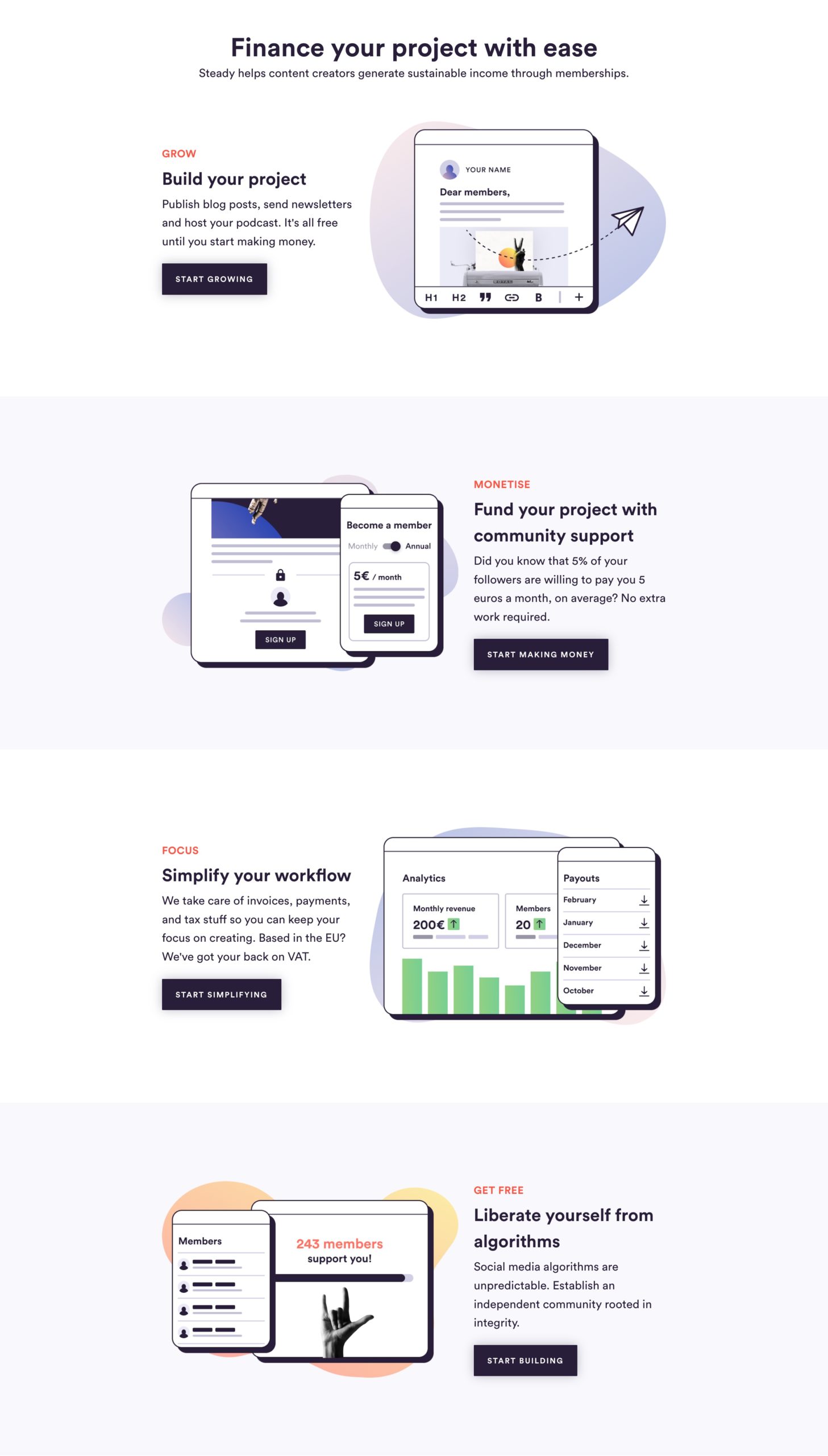
We revisited the homepage and marketing pages on average once a year to keep the team’s focus on the product features. In 2023, we wanted a leaner, product-focused presentation where the ‘baby screen' illustrations could present the creator’s growth journey and how easy it is to get started.
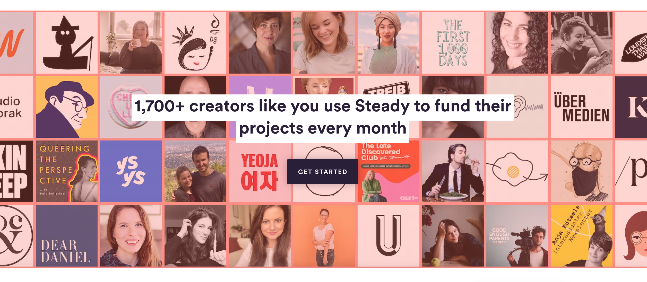
We also wanted to showcase the wonderful media creators choosing Steady–no stock photos or AI!
New product, new typeface
Within the first month of joining Steady, I was tasked with designing the 1.0 version of the post, newsletter and podcast editor. Next the many UX challenges, this also created an opportunity to extend the brand: the users publishing on Steady need to appear with a different voice than the company. The goal was to look polished and consistent with the existing design system, so I chose Bradford, a serif typeface from Lineto–the same type foundry that made Circular, the sans serif typeface Steady was already using. They blended well due to their matching visual rhythm and x-height. This serif typeface later also appeared in brand communications.
Social media content
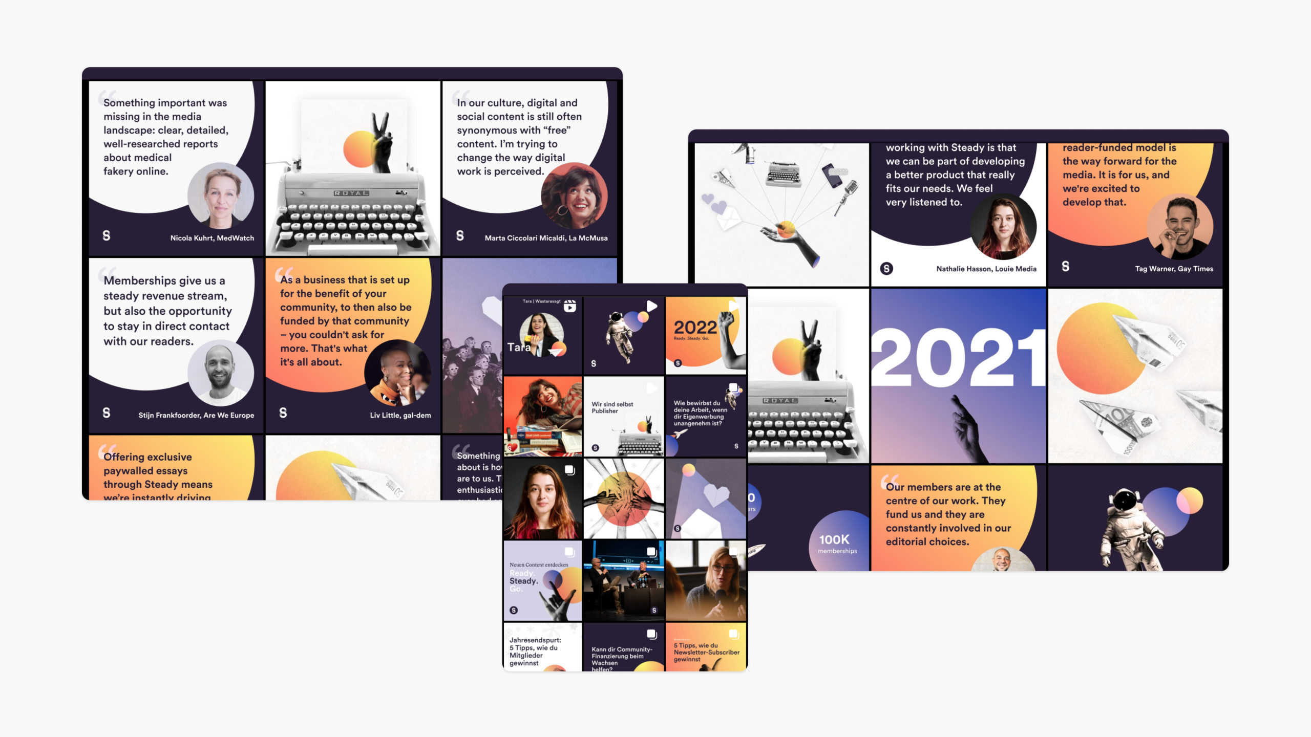
During the times we had no external help with managing our social media, I created templates displaying quotes from creators, graphics for special occasions and an image library to use for other kinds of posts as needed. These were built out from our existing visual library during breaks in product work. These posts were published in German, English, and sometimes also in French and Italian.
Icons
- I designed new icons to cover new functions in the product
- I aligned existing icon sizes, line weight
Design system work
The design system I received was a style guide in Figma that was gradually growing with each new design, but did not cover the complexity of the product or lead the way in consistency. In order to get there, I took small steps together or next to regular product or visual design work.
- Update: existing components to keep up with Figma's new features (I really love auto layout)!
- Rename: change the style and component names in Figma to match the names used in code. (Developers really loved this.)
- Organize: consolidate the existing product style guides into one file, remove any duplicates or retired components, document exitsting accessibility issues within the system
- Review, plan: Since we now had a clear idea of what we have, we also knew what was missing, and where we need to expand.
Since I was a solo designer working with 6 engineers, it made sense to bring in a freelance visual designer to take on our brief, and revisit the visual brand with fresh eyes, so it would communicate the company values of creativity and independence of small creators. (Thank you, Ben!) While he was working out the details after we agreed on the general visual direction, including losing the hard-to-grasp logo in favor of a wordmark, I prepared the plan to implement it together with the developers.
Our plan was to start with the tokens and go from the small building blocks: colors, typography, icons, and layout units, to more complex components, and prioritising accessibility at every level. I have even made my first commit to the style guide with the fresh and expanded color palette when, due to an unforeseen leadership change and layoffs, we had to stop the project–which is why I can't show the results.